One of the aspects shown on a statistics page of a publication on Genealogie Online is the “Distribution within the Benelux”. This map shows(approximately) where in the Belgium, Netherlands and Luxemburg area the genealogical events in the data collection took place. The larger the circle, the more events. This works reasonable when the numbers are small (see image below on the left) but doesn’t do well with big numbers (see image below on the right).


Hexagonal binning
What I wanted was a means to aggregate the data into a more coarse representation suitable for display. Enter hexagonal binning. Rather than displaying a scatter plot with tens of thousands of points/circles, you can bin points into gridded hexagons, and then display the distribution using colour and/or area.
I’ve worked with D3.js before, see for example the interactive paternal lineage graph. The D3 Javascript library helps you bring data to life using HTML, SVG and CSS. I started from the Bivariate Hexbin Map example which showcased the use of the d3.hexbin plugin. Where my previous distribution graph just worked with a base image, for the hexbin map I needed the contours of the Benelux countries in JSON format. I found I could generate a GeoJSON via an usefull website which had this public domain information. But, the hexbin map required a TopoJSON. This is an extension of GeoJSON that encodes topology. Rather than representing geometries discretely, geometries in TopoJSON files are stitched together from shared line segments called arcs. TopoJSON eliminates redundancy, offering much more compact representations of geometry than with GeoJSON; typical TopoJSON files are 80% smaller than their GeoJSON equivalents. With the use of the topojson tool I could easily convert the GeoJSON to the required TopoJSON.
The data which get’s binned is constructed by Genealogie Online from the users GEDCOM. Each place name, from individual events like birth and death and family events like marriage, is collected. The dataset of geographical database Geonames.org is used to lookup the longitude and latitude of each place. The quality of this fuzzy matching process depends on the quality of the data of the users. In general over 80% of place names is recognized. Lastly, the longitude/latitude values for each event are counted. This results in tab separated lines like “52.29616 4.57822 25” which translated to “in this publication 25 genealogical events were found which took place in Hillegom (Netherlands)”.
The hexbin map draws a hexagon for a specific area. The colour is determined by the number of events within this area, which could consist of multiple places. The d3.hexbin plugin takes care of the heavy lifting, basically it just takes the TopoJSON and the TSV and constructs the hexbin maps:
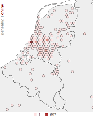

The result is cleaner, but maybe less impressive for the large numbers. To counter this a little bit, a legend was added to show what a hexagon represents (waarden=values). Still, the lightest colour in the left image could represent values 1-70, where as the same colour in the right image could represent 1-5000. More tweaking can be done by using other colouring scales (which now is linear) and the size of the hexagon.
Output format
The hexbin map is generated on the fly within the users browser. But this does require a modern browser, loading several Javascript files and the TopoJSON and TSV files. Alternatively the ‘HTML page’ could be loaded server-side by phantomjs, a headless WebKit scriptable with a JavaScript API. By scripting this in the whole publication process of Genealogie Online, the result is just SVG which D3 generated. The resulting SVG is somewhat big, around 400KB. Using an SVG scrubber like Scour the SVG can be optimised (which brings it down to 2/3) and compressed (which brings is down to 1/10). The resulting SVGZ is around 21KB. Browser support for SVG(Z) is pretty good, major exception being IE8. About 2.5% of Genealogie Online users still use IE8. So I should have a backup like a PNG version. From the SVG, a PNG can be made via svg2png. A final call to optipng downsizes the 112KB PNG to a 75KB file.
Work in progress
At the moment, the hexbin maps are only available as proof of concept. Looking at the maps resulted in new questions. Should the hexagons have tooltips? Should they be clickable, causing a geographical search within the publication for people with events in that area? Why limit the graph to the Benelux? Why not make the map zoomable and pan-able? Or should I just opt for the marker cluster solution I use on the Stamboom Forum (see image below, click it to see dynamic version)?


I think the hexagonal binning is beautiful and clean, but the hexagons take over the map and make it difficult to read. The cluster map is much easier to read.
If you allowed the hexagonal binning map to zoom, would the hexagon size be fixed to the screen size and therefore increase in number as you zoom or would they have a fixed geographic size and zoom with the map?
Justin,
Here's an example of a zoomable map with hexagons, where the hexagon size is fixed (seems the logical choice):
Failing Schools: UK Secondary School results, 2011
Also see a great write-up about it via Using a binning technique for point-based multiscale web maps
I like it. Might be a good alternative to our heatmap: https://www.findarecord.com/coverage